# Typographic classification and anatomy
# What is typography?
Modern typography is generally thought to begin with Johannes Gutenberg, the printing press and the development of moveable type, but its roots lie further back in handwritten letterforms which are the basis of type design.
In common usage, typography is the practical and artistic arrangement of type and printing with type. Although the term typography can also refer to the design and use of typefaces, from calligraphy to the use of digital type, as a means of visually communicating language through a series of characters. Typography in graphic design also involves the selection
of appropriate typefaces and their arrangement on the page.
Typography is sometimes seen as encompassing many separate fields from the type designer who creates letterforms to the graphic designer who selects typefaces and arranges them on the page.
Type is an ‘unconscious’ persuader. It attracts attention, sets the tone and feel of a document, and effects how
the reader interprets the document. Type has an effect on you even if you don’t notice it. You can use type to attract attention, strengthen a message and improve the way your message in interpreted.
Understanding principles of typography enable you to lay out text so that it can be read and understood easily.
[https://careerfoundry.com/en/blog/ui-design/beginners-guide-to-typography/](https://careerfoundry.com/en/blog/ui-design/beginners-guide-to-typography/)
### Terminology
The term ***typeface*** is frequently confused with font.
The two terms used to have more clearly differentiated meanings before desktop publishing became common-place and with it, the proliferation of ‘font’ files on the internet.
In professional typography, the two terms are not interchangeable.
#### Typeface
The typeface designates a consistent visual style or appearance, which can be a “family” or related set of fonts.
#### Font
A font designates a specific member of a type family such as roman, **boldface**, or *italic*. Font can also include the size of the face.
For example, a given typeface such as Arial may include roman, **bold**, and *italic* fonts.
A typeface is the artistic representation or interpretation of characters; it is the way the type looks. Each typeface is designed and there are thousands of different ones in existence, with new ones being constantly developed.
# Categories of type
Through the course of history typefaces have evolved through a series of stages which reflect the social environment. These stages of typeface development will typically be classified into groups with similar styles. These groups will be usually be based on visual similarities but can also be based on the historical time-line, the designer who created the typeface or purely on popularity and current trends.
Understanding type classifications can help when choosing the most appropriate typefaces to express a specific mood or feel.
There are two main categories of typeface used for general use.
- Serif
- Sans serif
There is a lot of discussion today, around whether serif typefaces are more readable than sans-serif with no conclusive evidence to prove either argument. In general though, serif type is still used for large amounts of text in print and sans-serif for use on the internet or other digital media.
Then there are three more categories for more specialised use.
- Script
- Decorative and display
- Ornamental
Each category has a very distinctive point of difference.
---
### Serif
The serif type category gets its name from the small strokes, which sit on the end of the main strokes of the individual characters, called ‘serifs’.
Serifs also have their own categories. Some are obvious while others are more subtle. The three categories of serif are hairline, square (slab), and wedge.
- Hairline serifs are much thinner than the main strokes.
- Square or slab serifs are thicker or even heavier than the main stroke.
- Wedge serifs are triangular in shape.
A more specific description of the serif will include if it is bracketed or unbracketed.
- Bracketed serifs have a curved join between the serif and the main strokes.
- Unbracketed serifs attach directly to the strokes of the letterform with no transition between serif and stroke.
Serif refers to any style of type that has serifs.
[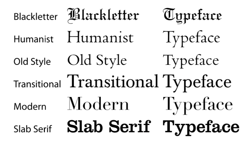](https://bookstack.chesterwhitwell.co.nz/uploads/images/gallery/2020-04/image-1586388105098.png)
Typefaces within each classification will generally have similar characteristics including the shape or appearance of their serifs.
---
### Sans Serif
The sans serif type category gets its name from the absence of serifs. ‘Sans’ being French for ‘without’.
Sans serif typefaces are a relatively new development in the history of type design. Its evolution is believed to have stemmed from slab serif typefaces in the early 1800s.
Sans serif type is traditionally used for signage, headings, and other situations demanding legibility above high readability. Nowadays—as people are becoming more familier with sans serif typefaces on screen—sans serif type is widely used for body text in print. Text on electronic media is also often laid out in sans serif typefaces because serifs can reduce readability on the low resolution displays like cell phones and computer monitors.
Like serif type, the sans serif typeface has also gone through phases of letterform development. The classic stages of development are:
[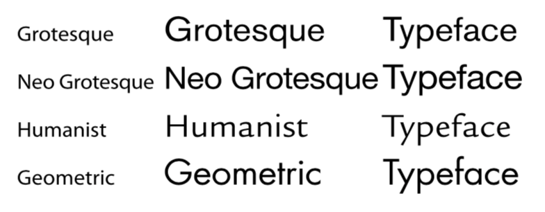](https://bookstack.chesterwhitwell.co.nz/uploads/images/gallery/2020-04/image-1586388288831.png)
Typefaces within each classification will typically have similar characteristics including stroke thickness, weight or certain letterform shapes.
---
### Script
This group of typefaces are based on actual hand written text.
Script typefaces will have their own voice or emotional element. They can appear elegant and calligraphic as if written by a flat-tipped quill or rough and quirky like a paint brush or crayon.
Because of the diversity of script typefaces, it’s almost impossible to have specific classifications. There are however some basic categories which can be used. They are formal, casual and hand. Blackletter and calligraphic are sometimes put into the script category.
[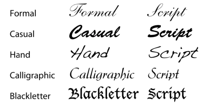](https://bookstack.chesterwhitwell.co.nz/uploads/images/gallery/2020-04/image-1586388334855.png)
Typefaces within each category will typically have loosely similar characteristics.
---
### Decorative
Decorative typefaces originated in the early days of poster advertising in the 19th century.
To get an original flavour or decorative elements onto a print using only off-the-shelf typefaces was difficult. To get around this problem a special print block would be created for just one specific word, heading or element.
Now with computers and desktop publishing software anyone can create a typeface for better or worse. There are literally thousands of them on the internet, free to download. Each one offering a different feeling or graphic style. Certain decorative typefaces will be very popular for a short time and then disappear as it goes out of fashion.
With so many decorative typefaces to choose they are beyond a formal classification system but tend to be sorted by genre or user created tags.
[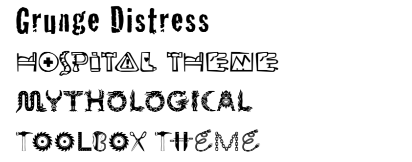](https://bookstack.chesterwhitwell.co.nz/uploads/images/gallery/2020-04/image-1586388500619.png)
Decorative typefaces can often sacrifice legibility in order to keep the theme of the typeface consistent.
---
### Ornamental
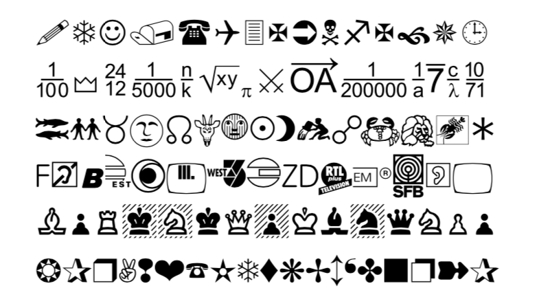
The final category can almost not be considered a typeface. This group is made up of character sets which include only symbols or sometimes illustrations.
Symbol sets typically have a theme like chess, maths or astrology while other sets are more universal and have a selection of multi-purpose symbols.
Because ornamental typefaces don’t match with the keyboard symbols, they can be difficult to utilise.
[](https://bookstack.chesterwhitwell.co.nz/uploads/images/gallery/2020-04/image-1586388544034.png)
# Categories of font
As the typefaces are categorised so to are the fonts within each typeface. Some typefaces have more fonts than others. These categories are based on:
##### Line weight
- Light
- Roman / Regular
- Semi-bold
- Bold
- Black
- Extra black
The term **uppercase** is a vestige of the days when typesetters separated capital letters in a box above the lowercase letters. It can also refer to any character which is accessed with the shift key on a manual typewriter.
[https://designmodo.com/typography-cheat-sheet/](https://designmodo.com/typography-cheat-sheet/)
[](http://www.planetoftunes.com/dtp/typography.htm)
**1. Baseline**
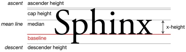
Majority of the characters sit on this imaginary horizontal line.
**2. Cap height**
The capline or cap height is another imaginary line wherein the heights of all the capital letters are marked in a typeface. However one has to keep in mind that the cap height is below the maximum height of the typeface.
**3. Crossbar**
The crossbar is a stroke that connects 2 lines in capital letterforms of *“A”* and *“H”*. Again a cross stroke implies a horizontal stroke that does not connect two lines, for example, the lower case of *“f”* or *“t”*.
**4. Serif**
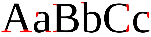
It is the name assigned to the finishing strokes at the tops and bottoms of some typefaces. There is a lot to discuss serifs when we would learn about typeface distinctions.
**5. Mean line**
The mean line better is known as midline is another imaginary horizontal line that marks the top edges of the lower case letters. You go wrong if you go by the literal definition of the term *“mean line”* because it actually doesn’t imply the central line between the baseline and the cap height.
**6. Bowl**
It is nothing but the rounded curve that covers the negative space in a letter form. Consider, for example, it can be easily viewed in the following letters *“I”*, *“e”*, *“D”*, *“o”* and *“g”*.
**7. Descender**
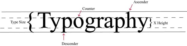
Descender happens to be the bottom part of the lowercase letter (like *“g”, “j”, “p”, “q”, “y”* etc) that usually goes below the baseline of a typeface. Some other features that particularly extend below this baseline comprise of the old style numerals typefaces. These specific numerals were basically thought to mix appropriately with the lowercase roman numbers. If used within the body of the text they really look good and beautiful.
**8. Counter**
Counter refers to the negative space within a letter, particularly if you consider letters like *“A”, “o”* and *“P”* etc where the counter is fully enclosed. In letters like *“G”, “u”* and *“c”* the non enclosed negative space is reflected and they are also called counters.
**9. Stem**
The main vertical or diagonal stroke depicted in a letterform is known as Stem. They consists of the vertical parts of the letters like *“I”* and *“H”* and also simultaneously all the strokes in the letter *“W”*.
**10. Tittle**
The title is defined as the dot above the lowercase *“j”* and *“i”*.
**11. Terminal**
The terminal is the culmination point of the stroke or stem that has no serif.
**12. Ascender**
It is an extension that goes above the meanline and is generally found in some lowercase letters. These letters are, *“b”, “d”, “f”, “h”, “k”, “l”* and *“t”.*
**13. Leg**
Legs are the lower angled strokes which you can see in the letters *“K”, “R”* and *“Q”*. They are also known as tails.
**14. Ligature**
This addition of two characters to create another character is called ligature. They are commonly seen in serif faces .It is present to give space between certain characters and give the characters an aesthetic imprint.
**15. X-height**
The space that exists in the vertical direction for the lowercase *“x”* in any typeface is known as X-Height. It is the distance the baseline and mean line of the body of characters in lowercase form. The X-Height is very important in the context of font shapes as the fonts with greater X-heights are easier to read.
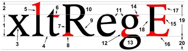
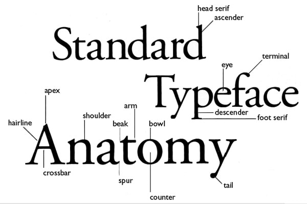
**Typographic parts of a glyph:** *1) x-height; 2) ascender line; 3) apex; 4) baseline; 5) ascender; 6) crossbar; 7) stem; 8) serif; 9) leg; 10) bowl; 11) counter; 12) collar; 13) loop; 14) ear; 15) tie; 16) horizontal bar; 17) arm; 18) vertical bar; 19) cap height; 20) descender line.*
*[https://designmodo.com/letterform/](https://designmodo.com/letterform/)*
# Yoobee house style/rules
### Paragraphs
#### Definition
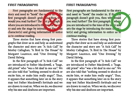
All paragraphs need definition. The most common choice are to use **First line indenting** or **Paragraph spacing**. (never use both in the same paragraph)
Use paragraph definitions consistently. Don't chop and change unnecessarily.
##### First line indenting
Applied using paragraph setting, never use Spaces or Tabs to create the indent.
Applied to the every paragraph after the first paragraph following a heading.
[](https://bookstack.chesterwhitwell.co.nz/uploads/images/gallery/2020-04/image-1586758052495.png)
##### Paragraph spacing
Can be applied to all paragraphs (including headings), as either **space after** (applied after each paragraph) or **space before** (applied before each paragraph). Before and After values are added together when they meet. so a heading with 3mm space after meeting a paragraph with 3mm space before, will have a 6mm space between them.
Never use a double return to create space, and spacing should never look like a double return.
Avoid floating headings. Heading that appear closer to the text above them than the text they are for.[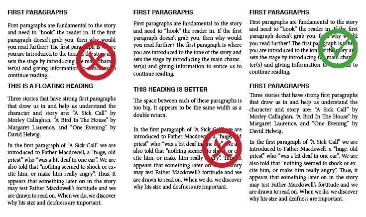](https://bookstack.chesterwhitwell.co.nz/uploads/images/gallery/2020-04/image-1586759099144.png)
---
### Hyphenation
#### Left/right aligned text
Use sparingly. Automatic hyphenation should be turned off for all left or right align text.
If necessary discretionary hyphens can be used. Never use a typed hyphen except unless for hyphenated words or names.
[](https://bookstack.chesterwhitwell.co.nz/uploads/images/gallery/2020-04/image-1586819966839.png)
#### Justified text
Less is better. Automatic hyphenation can be helpful as long as it is set correctly.
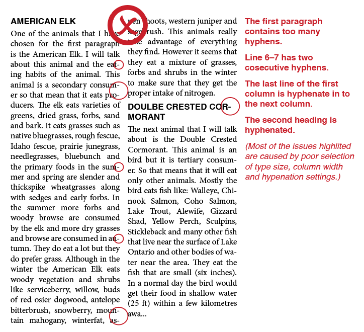
- No more than 4 hyphen in a paragraph.
- Never have 2 consecutive hyphens.
- Never onto the list line of a paragraph.
- Never hyphenate across columns.
- Never hyphenate headings, or capitalised names.
[](https://bookstack.chesterwhitwell.co.nz/uploads/images/gallery/2020-04/image-1586821979796.png)
[](https://bookstack.chesterwhitwell.co.nz/uploads/images/gallery/2020-04/image-1586898933584.png)
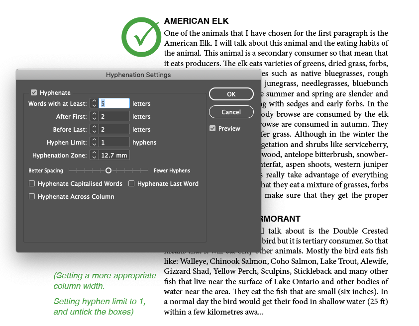
**Words With At Least \_ Letters **Specify the minimum number of characters for hyphenated words.
**After First \_ Letters / Before Last \_ Letters** Specify the minimum number of characters at the beginning or end of a word that can be broken by a hyphen. For example, by specifying 3 for these values, *aromatic* would be hyphenated as *aro‑ matic* instead of *ar‑ omatic* or *aromat‑ ic*.
**Hyphen Limit \_ Hyphens **Specify the maximum number of hyphens that can appear on consecutive lines. Zero means unlimited hyphens.
**Hyphenation Zone** Specify the amount of white space allowed at the end of a line of unjustified text before hyphenation begins. This option applies only when you’re using the Single-line Composer with nonjustified text.
**Better Spacing / Fewer Hyphens** To alter the balance between these settings, adjust the slider at the bottom of the dialog box.
**Hyphenate Across Column** To prevent words from being hyphenated across a column, frame, or page, deselect this option.