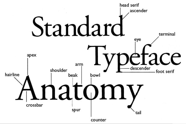
ANATOMY OF TYPE
The basic typographic element is called a character, which is any individual letter, numeral, or punctuation mark. The capital letters are called caps, or uppercase characters. Small letters are called lowercase characters. Numbers are called numerals or figures.
Within a given typeface each character will have distinctive similarities which define the typeface and give it it‘s individual style.
The distinctions in each character can be described using the terminology/vocabulary of typographic anatomy. Each of the following tables show a different area of the character.
The term uppercase is a vestige of the days when typesetters separated capital letters in a box above the lowercase letters. It can also refer to any character which is accessed with the shift key on a manual typewriter.
https://designmodo.com/typography-cheat-sheet/
1. Baseline
Majority of the characters sit on this imaginary horizontal line.
2. Cap height
The capline or cap height is another imaginary line wherein the heights of all the capital letters are marked in a typeface. However one has to keep in mind that the cap height is below the maximum height of the typeface.
3. Crossbar
The crossbar is a stroke that connects 2 lines in capital letterforms of “A” and “H”. Again a cross stroke implies a horizontal stroke that does not connect two lines, for example, the lower case of “f” or “t”.
4. Serif
It is the name assigned to the finishing strokes at the tops and bottoms of some typefaces. There is a lot to discuss serifs when we would learn about typeface distinctions.
5. Mean line
The mean line better is known as midline is another imaginary horizontal line that marks the top edges of the lower case letters. You go wrong if you go by the literal definition of the term “mean line” because it actually doesn’t imply the central line between the baseline and the cap height.
6. Bowl
It is nothing but the rounded curve that covers the negative space in a letter form. Consider, for example, it can be easily viewed in the following letters “I”, “e”, “D”, “o” and “g”.
7. Descender
Descender happens to be the bottom part of the lowercase letter (like “g”, “j”, “p”, “q”, “y” etc) that usually goes below the baseline of a typeface. Some other features that particularly extend below this baseline comprise of the old style numerals typefaces. These specific numerals were basically thought to mix appropriately with the lowercase roman numbers. If used within the body of the text they really look good and beautiful.
8. Counter
Counter refers to the negative space within a letter, particularly if you consider letters like “A”, “o” and “P” etc where the counter is fully enclosed. In letters like “G”, “u” and “c” the non enclosed negative space is reflected and they are also called counters.
9. Stem
The main vertical or diagonal stroke depicted in a letterform is known as Stem. They consists of the vertical parts of the letters like “I” and “H” and also simultaneously all the strokes in the letter “W”.
10. Tittle
The title is defined as the dot above the lowercase “j” and “i”.
11. Terminal
The terminal is the culmination point of the stroke or stem that has no serif.
12. Ascender
It is an extension that goes above the meanline and is generally found in some lowercase letters. These letters are, “b”, “d”, “f”, “h”, “k”, “l” and “t”.
13. Leg
Legs are the lower angled strokes which you can see in the letters “K”, “R” and “Q”. They are also known as tails.
14. Ligature
This addition of two characters to create another character is called ligature. They are commonly seen in serif faces .It is present to give space between certain characters and give the characters an aesthetic imprint.
15. X-height
The space that exists in the vertical direction for the lowercase “x” in any typeface is known as X-Height. It is the distance the baseline and mean line of the body of characters in lowercase form. The X-Height is very important in the context of font shapes as the fonts with greater X-heights are easier to read.

Typographic parts of a glyph: 1) x-height; 2) ascender line; 3) apex; 4) baseline; 5) ascender; 6) crossbar; 7) stem; 8) serif; 9) leg; 10) bowl; 11) counter; 12) collar; 13) loop; 14) ear; 15) tie; 16) horizontal bar; 17) arm; 18) vertical bar; 19) cap height; 20) descender line.

