Categories of type
Through the course of history typefaces have evolved through a series of stages which reflect the social environment. These stages of typeface development will typically be classified into groups with similar styles. These groups will be usually be based on visual similarities but can also be based on the historical time-line, the designer who created the typeface or purely on popularity and current trends.
Understanding type classifications can help when choosing the most appropriate typefaces to express a specific mood or feel.
There are two main categories of typeface used for general use.
- Serif
- Sans serif
There is a lot of discussion today, around whether serif typefaces are more readable than sans-serif with no conclusive evidence to prove either argument. In general though, serif type is still used for large amounts of text in print and sans-serif for use on the internet or other digital media.
Then there are three more categories for more specialised use.
- Script
- Decorative and display
- Ornamental
Each category has a very distinctive point of difference.
Serif
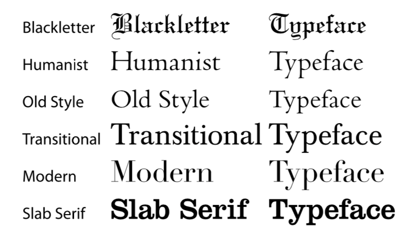
The serif type category gets its name from the small strokes, which sit on the end of the main strokes of the individual characters, called ‘serifs’.
Serifs also have their own categories. Some are obvious while others are more subtle. The three categories of serif are hairline, square (slab), and wedge.
- Hairline serifs are much thinner than the main strokes.
-
Square or slab serifs are thicker or even heavier than the main stroke.
-
Wedge serifs are triangular in shape.
A more specific description of the serif will include if it is bracketed or unbracketed.
- Bracketed serifs have a curved join between the serif and the main strokes.
- Unbracketed serifs attach directly to the strokes of the letterform with no transition between serif and stroke.
Serif refers to any style of type that has serifs.
Typefaces within each classification will generally have similar characteristics including the shape or appearance of their serifs.
Sans Serif
The sans serif type category gets its name from the absence of serifs. ‘Sans’ being French for ‘without’.
Sans serif typefaces are a relatively new development in the history of type design. Its evolution is believed to have stemmed from slab serif typefaces in the early 1800s.
Sans serif type is traditionally used for signage, headings, and other situations demanding legibility above high readability. Nowadays—as people are becoming more familier with sans serif typefaces on screen—sans serif type is widely used for body text in print. Text on electronic media is also often laid out in sans serif typefaces because serifs can reduce readability on the low resolution displays like cell phones and computer monitors.
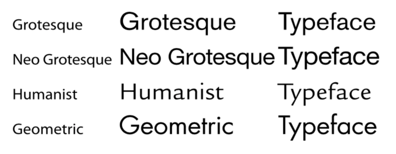
Like serif type, the sans serif typeface has also gone through phases of letterform development. The classic stages of development are:
Typefaces within each classification will typically have similar characteristics including stroke thickness, weight or certain letterform shapes.
Script
This group of typefaces are based on actual hand written text.
Script typefaces will have their own voice or emotional element. They can appear elegant and calligraphic as if written by a flat-tipped quill or rough and quirky like a paint brush or crayon.
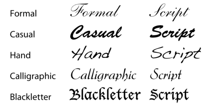
Because of the diversity of script typefaces, it’s almost impossible to have specific classifications. There are however some basic categories which can be used. They are formal, casual and hand. Blackletter and calligraphic are sometimes put into the script category.
Typefaces within each category will typically have loosely similar characteristics.
Decorative
Decorative typefaces originated in the early days of poster advertising in the 19th century.
To get an original flavour or decorative elements onto a print using only off-the-shelf typefaces was difficult. To get around this problem a special print block would be created for just one specific word, heading or element.
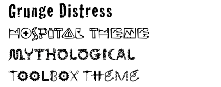
Now with computers and desktop publishing software anyone can create a typeface for better or worse. There are literally thousands of them on the internet, free to download. Each one offering a different feeling or graphic style. Certain decorative typefaces will be very popular for a short time and then disappear as it goes out of fashion.
With so many decorative typefaces to choose they are beyond a formal classification system but tend to be sorted by genre or user created tags.
Decorative typefaces can often sacrifice legibility in order to keep the theme of the typeface consistent.
Ornamental
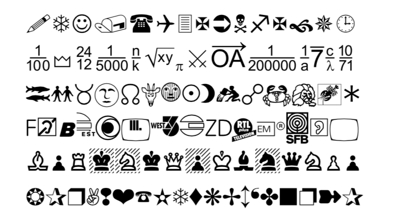
The final category can almost not be considered a typeface. This group is made up of character sets which include only symbols or sometimes illustrations.
Symbol sets typically have a theme like chess, maths or astrology while other sets are more universal and have a selection of multi-purpose symbols.
Because ornamental typefaces don’t match with the keyboard symbols, they can be difficult to utilise.

No comments to display
No comments to display